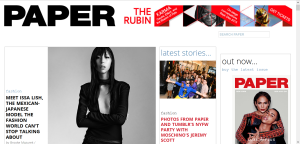
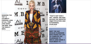
I really like the layout of Paper Magazine’s website. It may look plain to some of you, and it doesn’t have the most fancy features, but it’s still visually appealing in my opinion. Each story or photo series has a block on the site, and all of the blocks are pieced together like a puzzle. I love the bold headline on the page, and the differing fonts within each box. There is one photo for each story and box which quickly become the focal point of the entire page, and that’s one of my favorite parts.
Additionally, I think the fact that the stories are separated into boxes makes it easier for the viewer to see which stories interest them and which don’t. The bigger stories are emphasized with a larger box and photo, telling the viewer which ones may be more interesting to them.


Hey Jenna! I love PAPER! I think it’s simple but appealing to the reader. The font and visualization of the whole page is very mod and stylish, as a magazine should be.
Jenna! I really like the layout of this website. I’m big on minimalist, simplistic designs because I think they allow for the easiest navigation possible. And in a website especially navigation is key. I’ll definitely be checking out Paper 🙂