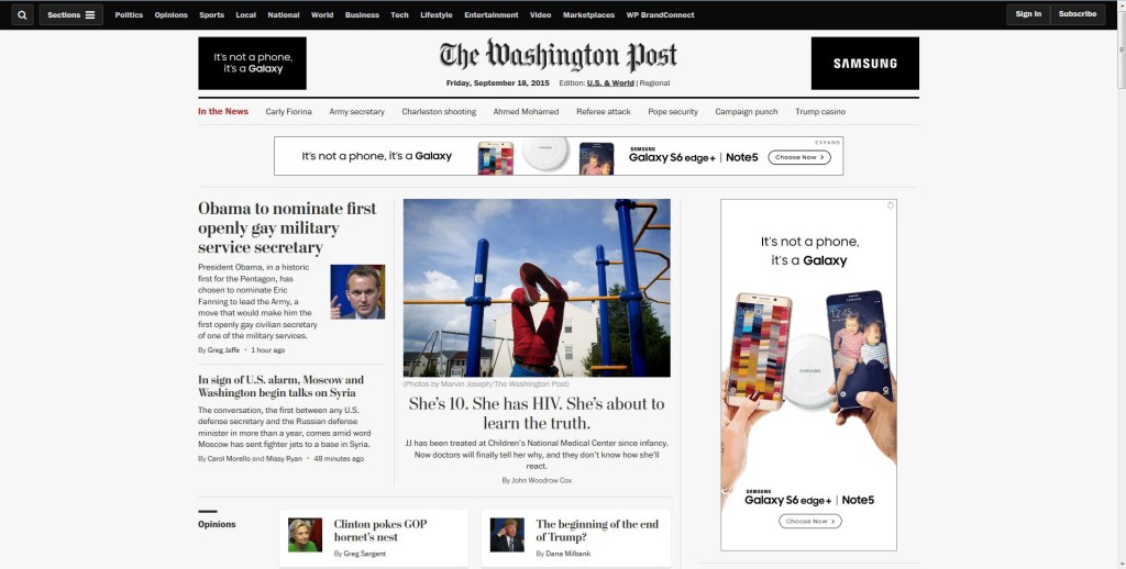
One of my favorite websites to visit is the Washington Post. Not only is it one of my go-tos for news, but I also believe it’s very well designed.
I like the way the home page is set up, with the masthead at the top and the “in the news” bar directly underneath it, so you can easily find any currently relevant news topics. I also like the three “front page” articles right below the “in the news” navigation bar. The ad is placed well, too, so that you can definitely see it, but it’s not in the way or obstructing your view of what you came to the site for.
 I also like the design of the sire once you click on an article. Options to change the text size, print and skip to the comments are right below the headline, and options to share on social media are right above it. There’s plenty of white space, and the page isn’t busy with ads or other clickables. I also like the sidebar with more recommended articles.

