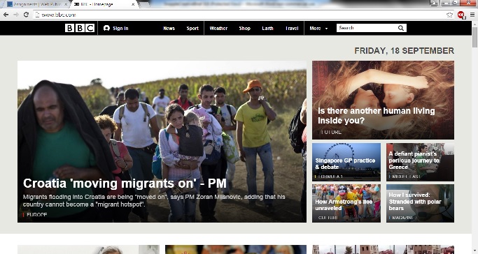
After bringing in a piece of news for class discussion, I stumbled upon another website I really enjoy. BBC.com is a site I regularly used before, but never realized its sophistication in web design. On a general inspection I really enjoy BBC’s clean look. The fonts used are crisp and easy to read. The page layout normal consists of well organized, high quality graphics accompanied by titles and captions. These graphics once clicked upon will take you to its related story. The navigation at the top of BBC’s pages is a feature I find extremely useful when on this site. It allows the viewer to narrow down their search to maybe news, sports, weather, etc. At the far right is of course their search bar which can come in handy for even more specific finds. As the viewer explores the navigation tabs, each separate page has their own vibe. The sports layout is bright consisting of mainly the color yellow, while the weather channel has earth tones such as blue and green. Each page is designed according to its function, tailored all the way to its colors. There is even a music page that gives off a dark and contemporary feel.
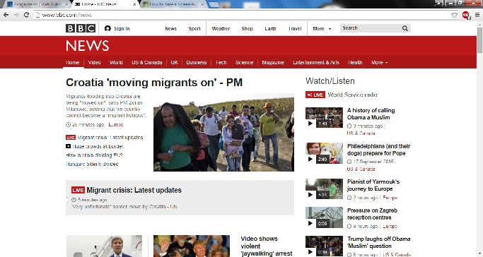
My favorite feature of the BBC is specific to its news page pictured above, and yes I have a “how to take a screenshot on a Dell” tab open (one step at a time). Once the news tab is clicked the vibe shifts in a more serious direction as the colors are then red. This layout is fabulous because it directly correlates with the page’s function, timeliness. Every graphic is a story to be clicked upon and expanded. Along with each graphic/story is a caption detailing how long ago this story was posted. For example if a breaking news story has been recently posted, under its graphic would be a clock icon reading “2 minutes ago.” This adds to the news site’s sense of urgency and that it’s organized in its delivery to its readers. There is also a “Most Popular” side bar to the right that lists the top 10 most read or viewed stories. I mostly enjoy this site as a whole, because I feel the BBC broadens its focus to more happenings around the globe versus what’s contained within our borders.


Morgan,
I also love BBC. They’re a great news site and their app is awesome as well. I think high-quality, eye-catching photos are something a news site needs to interest the reader more and BBC definitely nails it.
The BBC is one of my favorite websites to visit for news, as well. I love that the thumbnails of each story on the homepage are images because it’s so eye-catching. Also, I agree about the clock-icon feature. It definitely adds timeliness to the website’s headline stories.
Every time I get my news from BBC I feel like I’m getting the best news story. I actually got to visit the BBC headquarters when I traveled to London a couple summers ago and the tour was amazing! If you ever happen to find yourself there, definitely take the tour 🙂